Residential property brand
A complete brand book for a residential developer, from the logo to how every post, sign and uniform should look.
- Client
- Residential property developer, Thailand
- My role
- Brand identity, guidelines and art direction
- Delivered
- Brand book in four parts, mockup set
- Languages
- Thai and English
The brief
The developer needed a brand that could be handed to any designer or agency and still come out the same, on social posts, signs, print and uniforms.
So the job was two things: design the identity, and write down how to use it so clearly that nobody has to guess.
What had to work
- Feel calm and premium, right for higher-end homes.
- Work in Thai and English side by side.
- Be easy for other people to apply without me in the room.
What I did
- 01
Logo
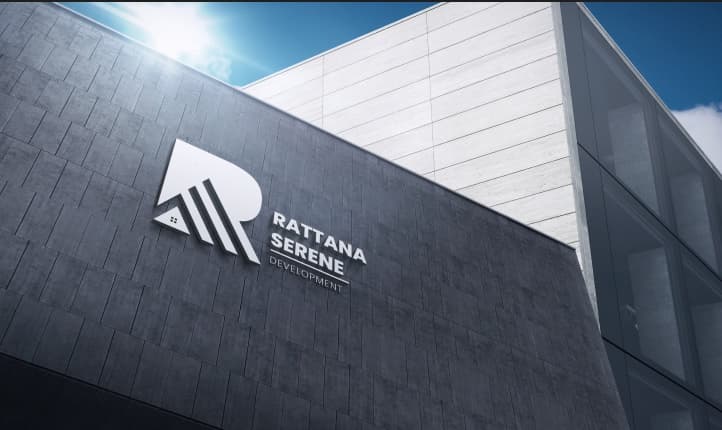
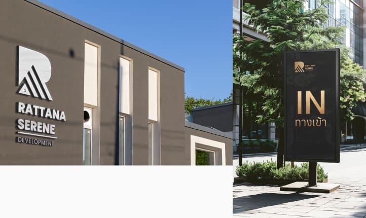
An R mark that also reads as a roofline. Full, alternative, transparent and one-colour versions, with safe space, minimum sizes, app icon and examples of what not to do.
- 02
Type and colour
Century Retrospective with Poppins for English, Anuphan with Noto Sans Thai for Thai. Bronze and gold gradients on black and white, plus neutral and one-colour palettes.
- 03
How the brand speaks
Content guidelines: tone of voice, how to write sentences and paragraphs, and how long a caption should be.
- 04
Art direction
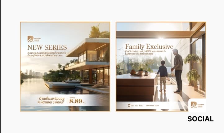
Key visual rules and a step-by-step graphic workflow: artboard sizes for Facebook and Instagram, then checks before a file is final. Worked design cases show the steps on real posts.
- 05
Mockups
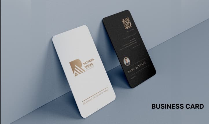
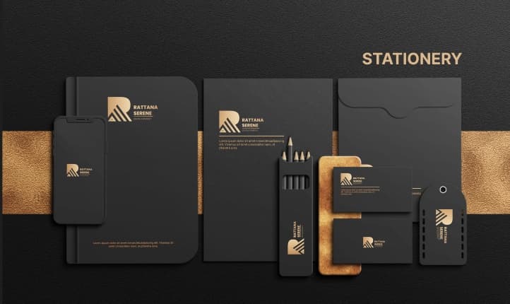
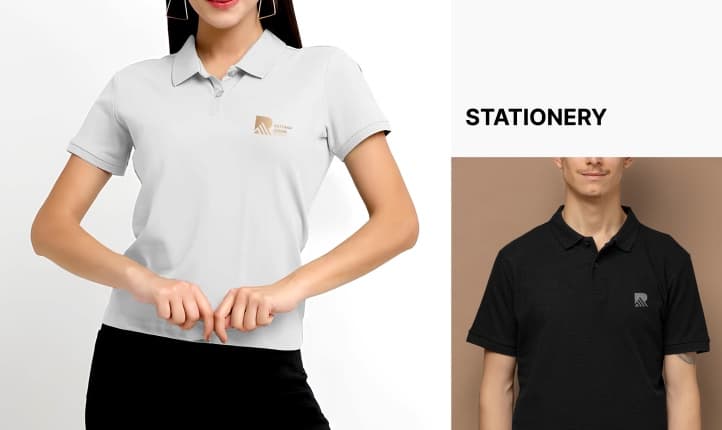
Business cards, stationery, signage, uniforms, social posts and watermark, so the client can see the brand in use before anything is printed.
Where it is now
A brand book in four parts (content, design, graphic steps and design cases) plus a full mockup set. The same identity now runs on the company's website.